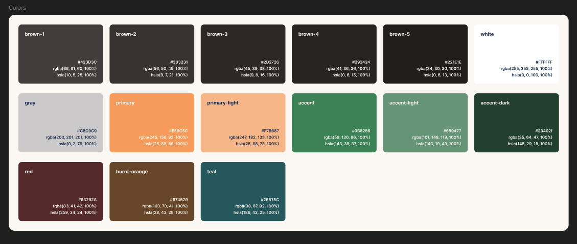
The colors
Colors and font-related values are the perfect use case for custom properties.
Not only does it mean we don't have to remember or constantly copy and paste hex codes or rgb values all the time, but it also makes changes very easy down the road, whether that's small tweaks or large-scale makeovers.
In this lesson, we'll start with our colors, which our small design system has for us:

Naming variables
Naming things is hard and is something that a lot of people have strong opinions about.
Once again, I'd suggest finding a naming convention that works for you (or sticking to what your team is using).
The convention itself isn't the important part of using a naming convention, instead it's the consistency that it creates.
For example, in our system, we have a large range of browns, but then single versions of other colors.
We could use the names directly from the Figma file:
:root {
  --white: #fff;
  --primary: hsl(25, 88%, 66%);
  --primary-light: hsl(25, 88%, 54%);
  --brown-1: rgb(66, 61, 60);
}
The thing is, we have a bit of a strange mix here, both in their names and values.
I generally try to find a more consistent way to name them.
If you are working in a team, there is a good chance the naming convention from Figma is also being used in the codebase. These types of things tend to carry over. However, when you're creating your own projects, or are working with designs provided by clients, this often isn't the case. These are the cases where I'd change things to be more consistent, as we're doing here.
I tend to use a color scale that goes from 100 to 900, and use 500 as the "base" color, with higher numbers being lighter, and lower numbers being darker.
This makes it easy to add more later on if I need to, including squeezing in a 450 if a needed.
So, for example, with the green color:
:root {
  --clr-green-400: #659477;
  --clr-green-500: #3b8256;
  --clr-green-600: #23402f;
}
The custom properties I'll be using
Copying and pasting values from Figma to your editor can be a little tiresome (though there are Figma plugins that can help), so below are the custom props I'll be using.
We will be creating more later on, based on these values, but this gives us a good start.
:root {
  --clr-white: hsl(0, 0%, 100%);
  --clr-gray-100: hsl(0, 2%, 79%);
  --clr-brand-400: hsl(25, 88%, 75%);
  --clr-brand-500: hsl(25, 88%, 66%);
  --clr-green-400: hsl(143, 19%, 49%);
  --clr-green-500: hsl(143, 38%, 37%);
  --clr-green-600: hsl(145, 29%, 19%);
  --clr-brown-500: hsl(10, 5%, 25%);
  --clr-brown-600: hsl(9, 7%, 21%);
  --clr-brown-700: hsl(9, 8%, 16%);
  --clr-brown-800: hsl(0, 6%, 15%);
  --clr-brown-900: hsl(0, 6%, 13%);

  --clr-orange-500: hsl(28, 43%, 28%);
  --clr-red-500: hsl(359, 34%, 24%);
  --clr-teal-500: hsl(186, 42%, 25%);
}