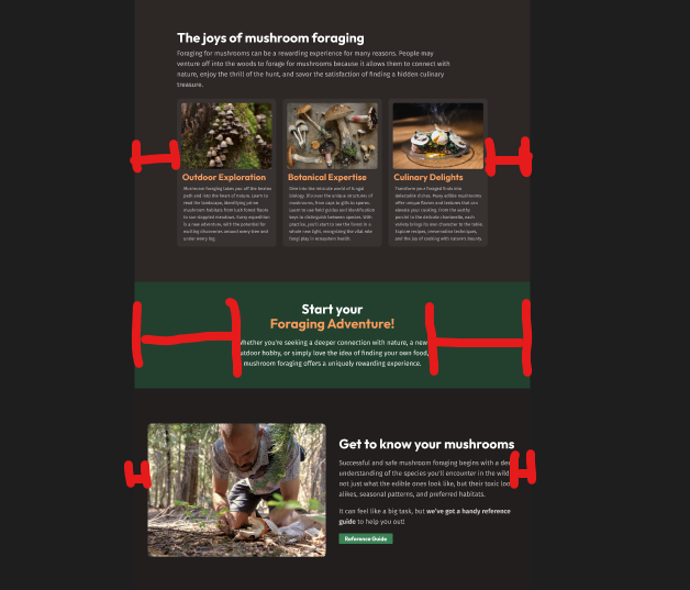
Wrappers (or containers)
I used to call these containers, but since container queries were added to CSS, I've switched to wrapper. While container is a more common name for this pattern, both of them are very common. And having a
.containerthat isn't defining a CSS container feels like it could lead to confusion, so I've stopped using it.
As with just about any project you'll ever work on, you need to limit the maximum width the content can reach.
Before we worry about any other layout type styling, it feels like a good first step we can take.
To do this, we can use a .wrapper or .container class, like this:
@layer layout {
  .wrapper {
    max-width: 1130px;
    margin-inline: auto;
    padding-inline: 1rem;
  }
}
Different sizes of containers
In this project, we have different max widths in different sections.

In this situations, it's common to create modifier classes, with a "standard" wrapper, and then a narrow and wide variant:
.wrapper {
  max-width: 1130px;
  margin-inline: auto;
  padding-inline: 1rem;
}

.wrapper--narrow {
  max-width: 720px;
}

.wrapper--wide {
  max-width: 1330px;
}
The -- is from the BEM naming convention, and helps distinguish that something is a modifier class, and not simply the name of something.
And then we could use them like so:
<div class="wrapper">...</div>
<div class="wrapper wrapper--narrow">...</div>
<div class="wrapper wrapper--xl">...</div>
Locally scoped custom properties
While this works very well, this is another great time to let custom properties enter the picture, where we could do it like this instead:
.wrapper {
  --wrapper-max-width: 1130px;
  --wrapper-padding: 1rem;

  max-width: var(--wrapper-max-width);
  margin-inline: auto;
  padding-inline: var(--wrapper-padding);
}

.wrapper--narrow {
  --wrapper-max-width: 720px;
}

.wrapper--wide {
  --wrapper-max-width: 1330px;
}
And while it's not as obvious in this example, using locally scoped custom properties like this can also make your code easier to understand with more complex CSS, specially when you have modifiers for hover states and other things that normally require multiple selectors.
Data attributes for modifiers?
I first came across the idea of using data-attributes when Andy Bell introduced CUBE CSS, and while not common, I have been seeing it more often.
.wrapper {
  --wrapper-max-width: 1130px;
  --wrapper-padding: 1rem;

  max-width: var(--wrapper-max-width);
  margin-inline: auto;
  padding-inline: var(--wrapper-padding);
}

.wrapper[data-type="narrow"] {
  --wrapper-max-width: 720px;
}

.wrapper[data-type="wide"] {
  --wrapper-max-width: 1330px;
}
This is not a very common pattern at the moment, but I quite like it, and often feel like it makes for more readable HTML.
For example:
<div class="card card--full-bleed card--inverted">...</div>
<!-- vs. -->
<div class="card" data-layout="full-bleed" data-theme="inverted">...</div>
If you hate this idea, I'd suggest giving this approach a try for this project to see if using it changes your mind about it or not!
Matching the Figma file
We need to be careful when getting the width of an element from Figma.
Because we have padding on these elements, it's making the containers slightly narrower than the Figma designs.
We could do two things:
- Add our padding to the total width
- Change the
box-sizingon the wrappers tocontent-box
I think there are times to use calculations for the size of things, but for a simple container, I don't see anything wrong with changing the box-sizing and not worrying about it.
.wrapper {
  --wrapper-max-width: 1130px;
  --wrapper-padding: 1rem;

  max-width: var(--wrapper-max-width);
  margin-inline: auto;
  padding-inline: var(--wrapper-padding);

  /* helps to match the Figma file */
  box-sizing: content-box;
}
Nesting
Nesting is supported in native CSS now, and I, for one, am all in on using it.
.wrapper {
  --wrapper-max-width: 1130px;
  --wrapper-padding: 1rem;

  max-width: var(--wrapper-max-width);
  margin-inline: auto;
  padding-inline: var(--wrapper-padding);
  /* helps to match the Figma file */
  box-sizing: content-box;

  &[data-width="narrow"] {
    --wrapper-max-width: 720px;
  }

  &[data-width="wide"] {
    --wrapper-max-width: 1330px;
  }
}
The & is a placeholder for the original selector.
Very importantly you cannot do this if you are using the BEM naming convention.
While pre-processors like Sass allow for &--wide, that doesn't work in native CSS nesting, because it would be the equivalent to writing --wide&. The & is it's own, independent selector.